How should we summarize performance numbers? In a recent benchmark run, I had some interesting speedup numbers that I wasn’t certain how to report. While it’s easy to make charts that are illuminating, I’m not certain what I should say in, e.g., an abstract.
Here’s the raw data (also available as a spreadsheet), noting that I’ve made everything as abstract as I can:
In the data, I’ve recorded the runtime of 2 tools (tool1 and tool2) on 40 tests. The tests are lettered by theme, with a number to distinguish tests that are somehow related. Each runtime in the table is in seconds, and is the arithmetic mean of three runs exhibiting nominal variation. I run tool1 in two configurations: tool1 simply solves the problem, while tool1.min tries to solve the problem “minimally” in some sense. I run tool2 in only one configuration. In the spreadsheet, I’ve calculated a few summary statistics for each column. Here are the summary statistics for tool1 vs. tool2:
| Min | 1.00 |
| Arithmetic mean | 156.84 |
| Geometric mean | 12.64 |
| Harmonic mean | 4.49 |
| Median | 7.57 |
| Max | 3332.12 |
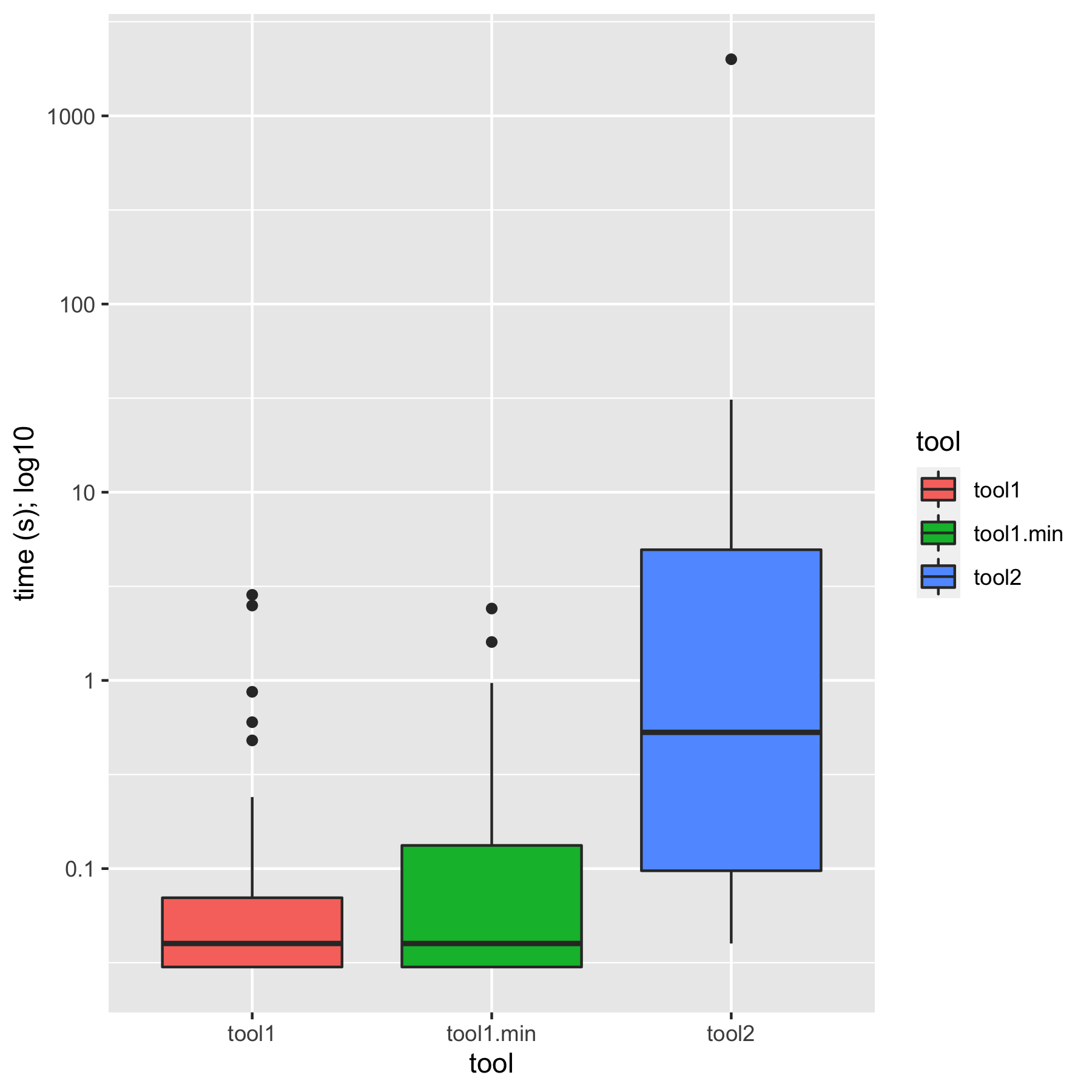
Doing some cursory analysis in R, it’s easy to generate charts that give a pretty good feel for the data. (It’s all in mgree/summarizing-perf on GitHub.) Here’s a box plot of times:
And here’s a violin plot of times:
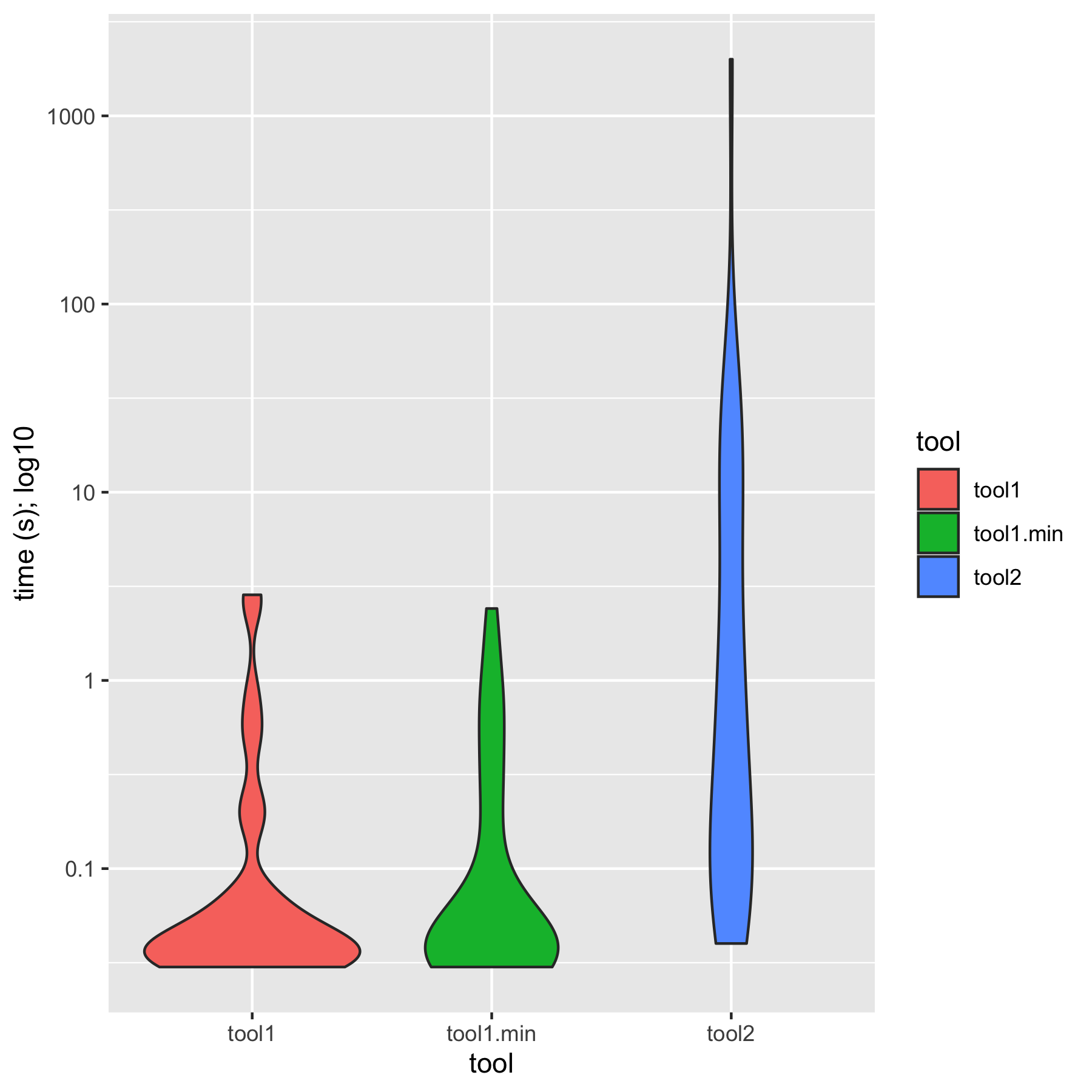
I would summarize these charts in text as, “tool1 is an order of magnitude faster than tool2; minimization closes some of the gap, but tool1.min is still substantially faster than tool2”. A bar chart tells the same story:
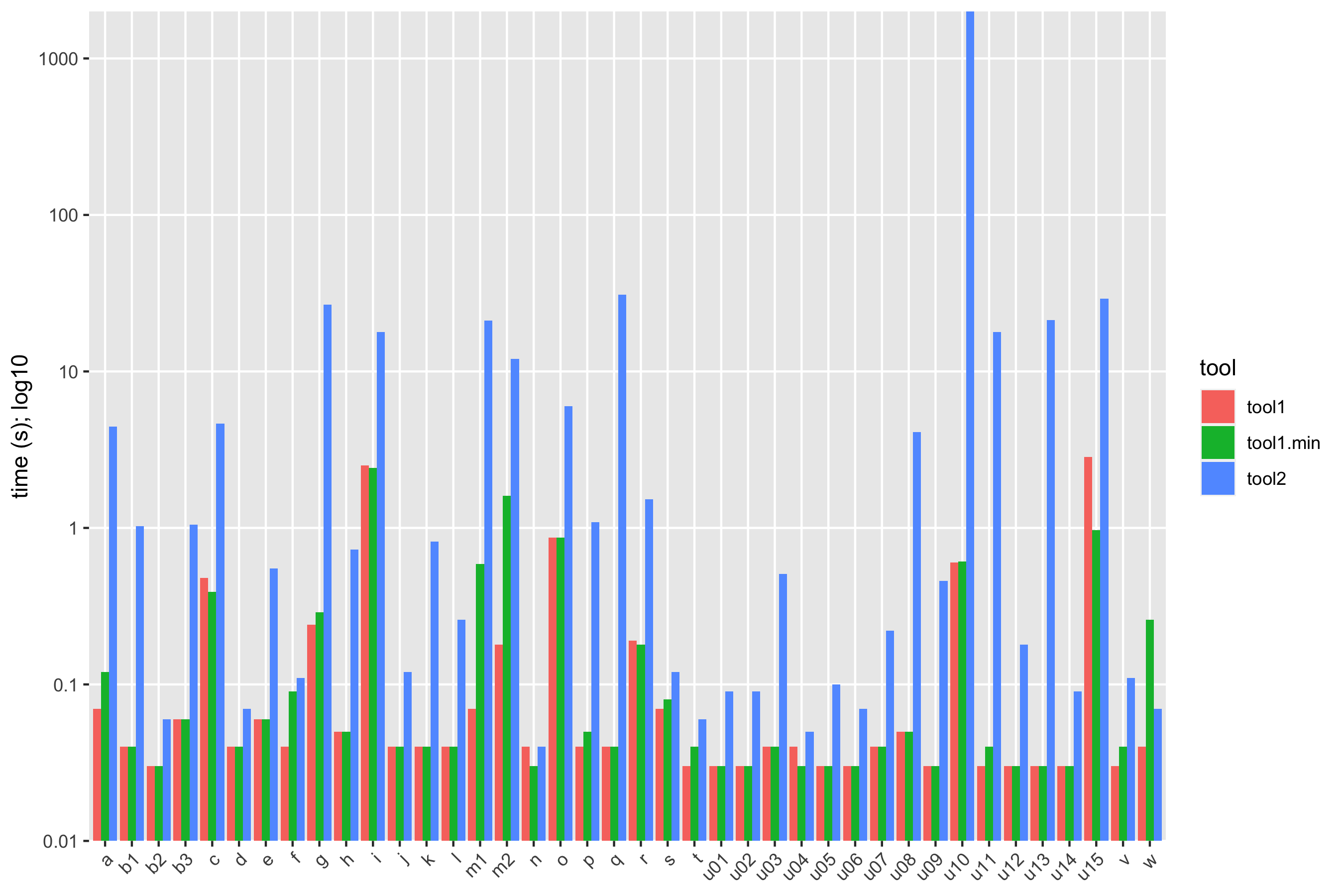
With the bar chart, it’s possible to see that sometimes tool2 is in the same league as tool1, but not usually. We have tool2 beating tool1.min only once (test w); it never beats tool1, and typically loses by 1-2 orders of magnitude. Some cases are catastrophically bad.
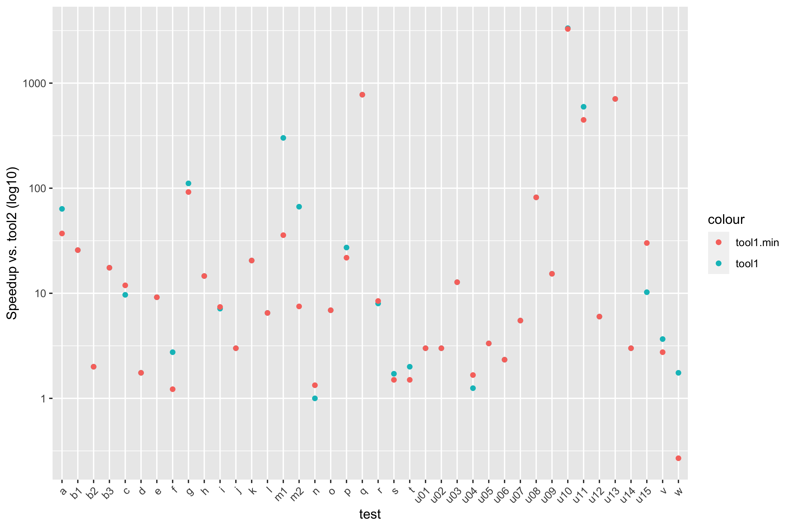
Plotting speedup lets us justify some other comments. Here’s a scatter plot:
And here’s a boxplot of speedups in aggregate:
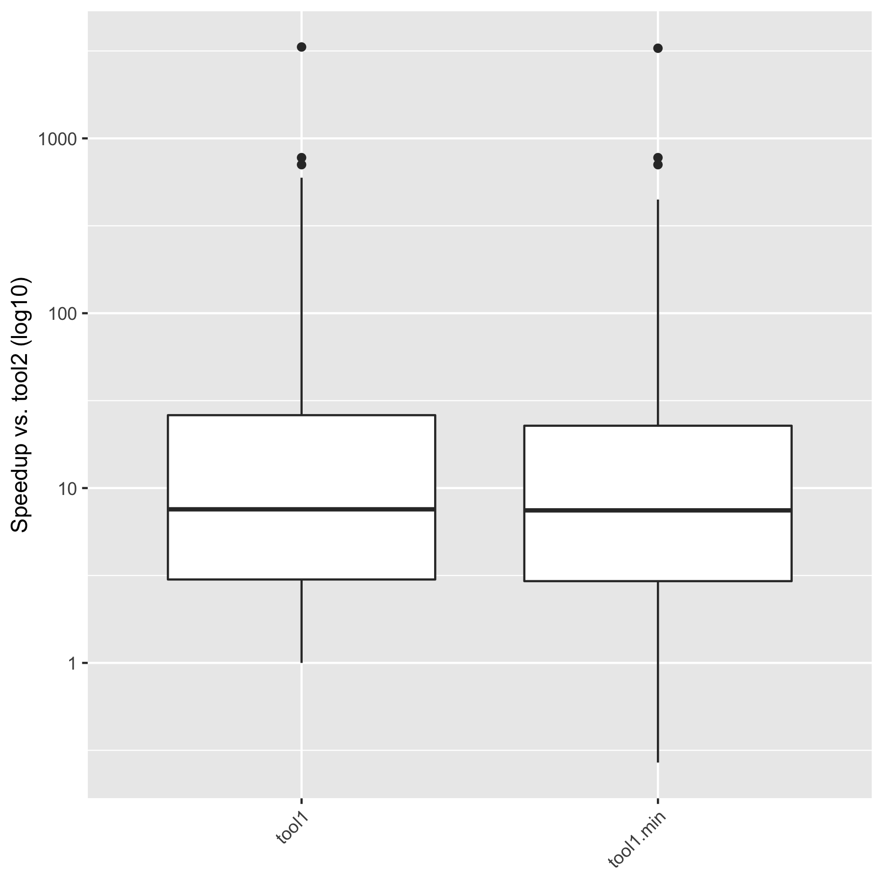
Looking at these speedups, I’d feel comfortable saying that “tool1 is typically an order of magnitude faster than tool2, never slower, and sometimes much faster; tool1.min behaves similarly, though it can sometimes be slower”.
This post comes out of a Twitter thread, which is a goldmine of insight and resources. Please check it out, and chime here or in the thread with your thoughts!
I have a range of speedups to report vs. another tool, running on the same machine. There’s a fair bit of variance—sometimes we’re close to 1 ??????? usually we’re in the 10x range ???? and sometimes we’re much, much, MUCH better ????
— Michael Greenberg (@mgrnbrg) December 13, 2021
How do I summarize these statistics?
Special thanks to Noam Ross for help with some of the fancier log-scale stuff on the plots.